Edmonton Typography Series
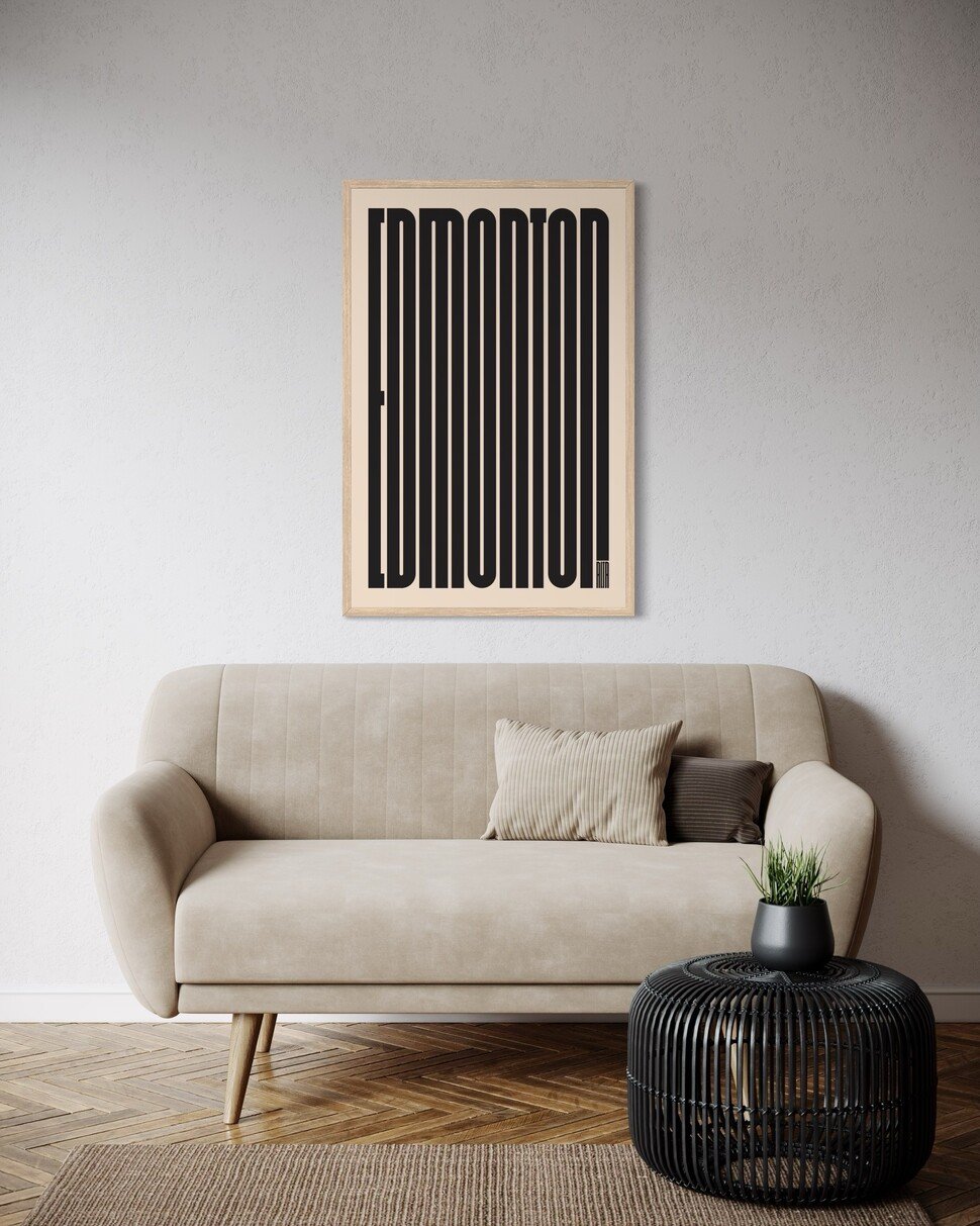
The Edmonton Typography Series is a bold exploration of place through pure form, transforming the name Edmonton into a striking visual identity. Each print uses tall, condensed lettering stretched into rhythmic vertical lines, creating compositions that feel both architectural and deeply graphic.
Rooted in modernist design principles such as repetition, scale, and contrast, the series turns typography into pattern. The elongated letterforms echo urban density, skyline silhouettes, and the structured energy of a growing city, while remaining clean and minimal.
What sets the series apart is its use of colour. Each edition shifts the tone and personality of the same composition. Vibrant chartreuse feels playful and energetic, red is bold and commanding, gold adds warmth and optimism, black is classic and timeless, and teal brings a calm, contemporary balance. Together, they show how colour alone can completely transform mood while the underlying design remains constant.
At its core, the Edmonton series is about identity. It captures the city not through landmarks or imagery, but through abstraction and repetition, offering a fresh, design-forward way to celebrate Edmonton. Whether displayed as a single statement piece or as a full colour set, the series reflects both the diversity and cohesion of the city itself.
Leave a comment
Recent articles
View All
Holiday Shipping Deadlines 2025

New Bee Waeland Geometric Series